
Astoundify’s Black Friday & Cyber Monday Sale: Massive Savings Unlocked!
Black Friday and Cyber Monday are here, and it’s time to get incredible discounts on products that support your business. This is…
Read article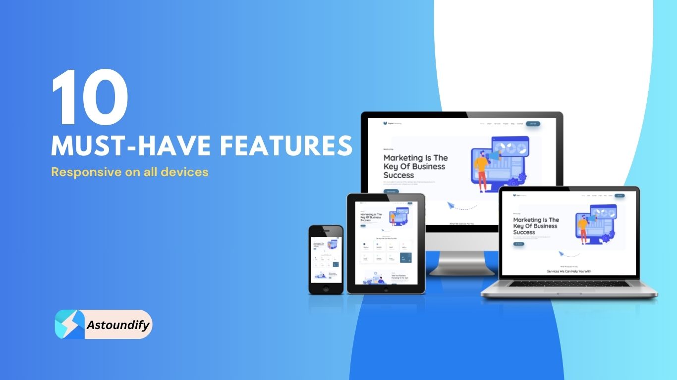
What makes a modern responsive WP theme? Smartphone usage is growing faster than all of the inside predictions of Google. That’s why your website must be mobile-friendly for which your theme must be responsive. You cannot ignore the potential of mobile traffic as a site owner.
A modern responsive WP theme adapts its layout to fit according to mobile devices. We have discussed ten must-have features of responsive themes you must consider before buying your next premium theme in this blog.
The gist is to follow standard coding, design, and security practices. We have listed the top 10 crucial factors that must be present in your theme. So, ensure you tick this checklist next time before buying a WordPress theme.

Smart navigation ensures your customers can easily find what they are looking for in the first place. Modern responsive WP themes comes with a clean and logical navigation system.
It includes a comprehensive navigation menu that is well-organized, user-friendly, and informative. Also, check for sticky navbars in your theme. The sticky menu remains fixed on a webpage irrespective of scrolling.
Typography choices play a crucial role in responsive WordPress themes. Font types also impact readability, personality, style, and overall message your webpage wants to convey.
Font pairing needs to be done right based on the niche. A modern responsive WP theme knows how to use different fonts with different weights to deliver the right brand message.
Responsive or adaptive images ensure adaptability according to the device specifications and screen sizes. Optimized images also mean reduced HTTP requests that contribute to faster loading times.
Modern WordPress themes use responsive images for efficient bandwidth usage, faster loading time, and improved user experience. However, WP 4.4 automatically sets up responsive images when you add images to your Media Library.
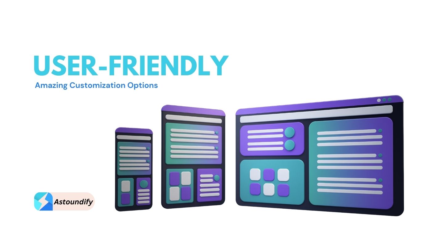
Modern responsive WP themes provides ample customization options. You can either purchase a premium custom theme or hire a professional theme developer to create one for you.
A custom theme or WordPress theme with enough customization options is always a plus for any business. It offers excellent performance, security, SEO-friendliness, and first-hand support from developers.
SEO-optimized themes increase the chances of web pages appearing prominently in search engine results. You allow Google crawlers to access your website by choosing an SEO-friendly WordPress theme.
Site audits can tell how easy it is for Google crawlers to navigate your site. Customization options of themes should be easy to use, so users can seamlessly integrate SEO optimization practices. Look for inbuilt options for optimization and customization in your WordPress themes.
Schema markup provides detailed content information about your website to search engines. Responsive themes support schema markup options that help incorporate specialized search features into websites.
Schema sorcery also helps add significant elements like rich snippets and knowledge panels. A notable boost in SEO can be seen after using schema markup.
A good theme must offer a light user interface (UI) and a great user experience (UX). A better UI/UX also ensures your website is easy to navigate along with giving it a visual appeal.
User experience design involves researching and understanding your target audience. On the contrary, UI design refers to the website layout, including the placement of the images, buttons, and text.
A theme’s code plays an important role in the performance, security, and SEO of your website. A theme developer needs to follow the best coding practices as laid out by WordPress.
Clean and optimized code makes your website perform better in search engines. A lightweight theme with an optimized code minimizes the use of JavaScript and CSS files.
A modern theme utilizes a logical WordPress template hierarchy structure. The structure determines the usage of the template file while displaying the web page.
Template hierarchies depend on two factors: visitor content and whether the current theme’s directory contains the corresponding template.
Modern responsive WordPress themes follow security best practices such as sanitizing user input, using nonces, and escaping output. Regularly updating and maintaining WordPress themes also ensure the security of a theme
A secure theme meets WordPress standards. Check whether your theme is secure or not via the Theme Check WordPress plugin. Checking the credibility of the theme via user reviews is also an indicator of the theme’s security.
Having said that, we have wrapped up our blog on must-have features in responsive WordPress themes. It is not just about the features; it is about the commitment to your success.
At Astoundify, we craft premium WordPress themes and plugins that indicate a perfect fusion of cutting-edge design, robust security, and standard coding practices. We provide regular updates and top-notch customer support to ensure your website stays atop.
A responsive theme allows a website to adapt itself to mobile devices seamlessly without blurring or disturbing the overall layout of the website.
A logical WordPress template hierarchy, flexible layouts, and grids, and following better UI/UX practices are some of the keys to developing a responsive design.
You can do a mobile-friendly test or use a plugin like Theme Check to ensure your theme is responsive.
A modern theme means nothing but a responsive WordPress theme that adheres to standard coding, design, and security practices.
The three categories of responsive websites are adaptive design, fluid design, and fluid responsive layout.
Black Friday and Cyber Monday are here, and it’s time to get incredible discounts on products that support your business. This is…
Read articleA property listing website is a profitable business idea. Even though real estate capital markets are tightening, they are still open and…
Read articleIntroduction In today’s digital age, where finding the perfect candidates for your job openings can be a challenging task, harnessing the…
Read article